Using card style design to improve your intranet design & user experience
First pioneered by Pinterest and now adopted by Facebook, Twitter, Google and other web titans, card based user interfaces are the on-trend web and intranet design. What is the reason for this shift and what are the benefits of applying this idea to your organization's internal intranet?
How intranet design impacts employees
Employees using intranet are faced with information overload on a daily basis, with each corporate function jostling for space on the home page along with internal communications around this week’s top news, strategic direction, important project updates, new sales wins – the list is seemingly endless. So what impact does this intranet idea have on your employees?
According to Harvard Business Review 'Current research suggests that the surging volume of available information can adversely affect not only personal well-being but also decision making, innovation, and productivity.' When faced with so much information on your screen, how do you manage this effectively to ensure employees read AND retain the messages they need in a stimulating, organized and visually clear way?

How can changes to your user interface help?
When faced with similar conundrums on the web, the rise of mobile and content surfacing from a plethora of different sources, user experience designers pioneered the card-style design concept. With an ability to surface a lot of information in a more intelligible and digestible format, Paul Adams of Intercom comments that “We are currently witnessing a re-architecture of the web, away from pages and destinations, towards completely personalized experiences built on an aggregation of many individual pieces of content.”
User experience benefits
- Cards can be used in a variety of ways to satisfy specific functions and Web Design Ledger suggests the following primary reasons to introduce card-style interfaces into your intranet design:
- Cards grab attention. They’re an exciting alternative to overly gratuitous text.
- Cards are responsive. Designing for mobile browsers is a necessity, and cards are great for responsive intranet design.
- Cards are digestible. Because of their limited space, cards can’t really say much. But that’s a good thing! Readers who want more can click to get it.
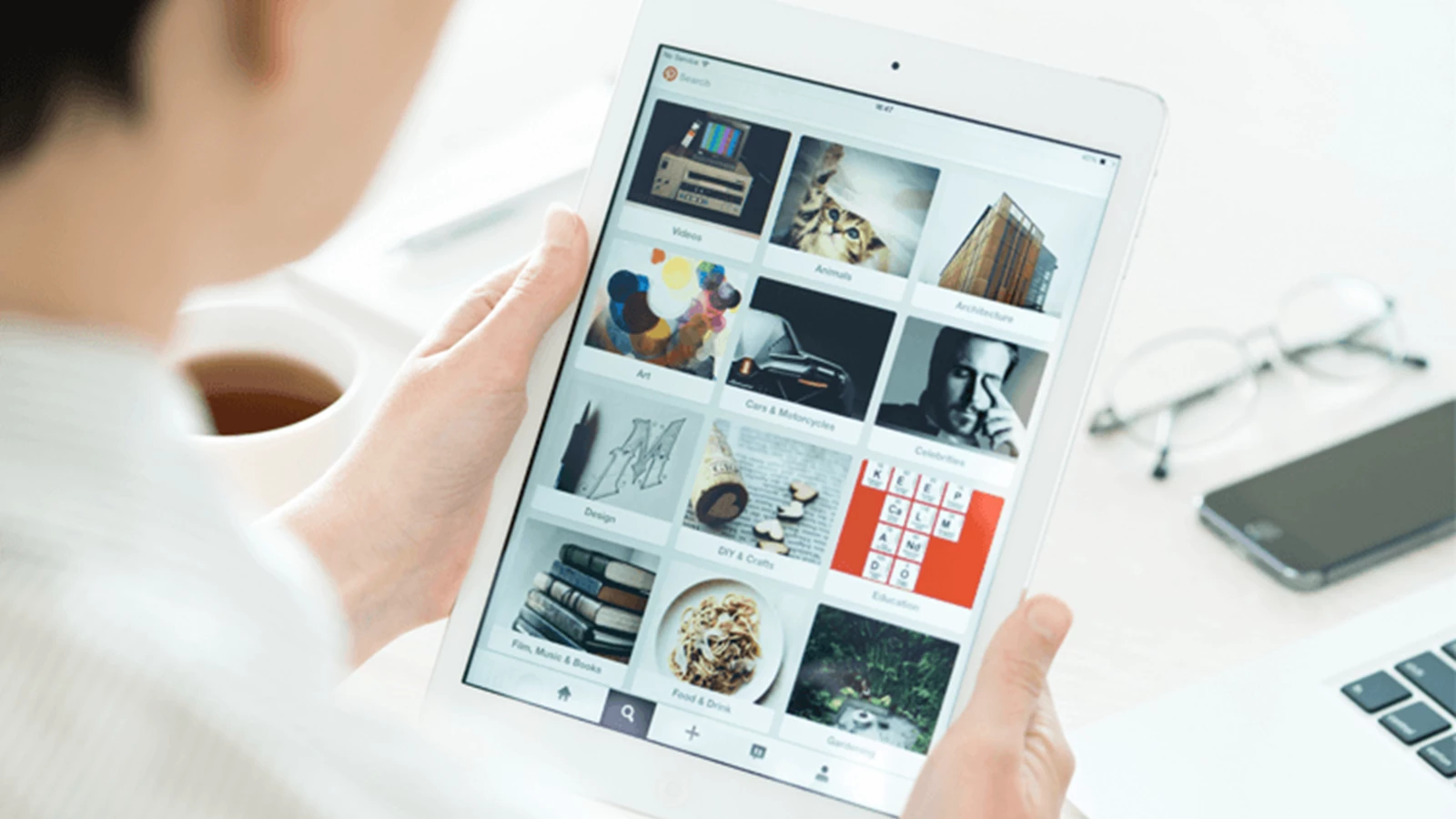
Examples of card-style intranet design in enterprise
How does card style intranet design look in practice? Here we surface a few examples:
#1. News & internal communications
Magazine style internal communications provide employees with an at-a-glance view of what they need to know, allowing the aggregation of different types of content seamlessly and ensuring the message is seen and understood.

#2. People directories
Cards can provide the ultimate people directory experience by putting both a face to a name and enabling people to be found by name, location, role, skills and more. This gives an instant and always up-to-date directory of your colleagues.

#3. Document management layout
Using a Pinterest style user experience, end-users have a visual alternative to endless rows of text-based data. Users can quickly filter through vast quantities of content in seconds using search and intelligent refiners. Content previews and meta-data provide a clue as to the document contents prior to opening giving a more informative approach to intranet document management.

#4. Enterprise social
A thriving and dynamic internal social network will generate a lot of content and cards help users who are short on time to see what’s new at a glance, for example, social conversations from Yammer.

Making intranet design work better
The screen real-estate available in your corporate intranet is a limited and valuable resource. Everything you place on a page should provide a purpose and add value to end-users. In many cases, less is more. Intranet interfaces focusing on bombarding your employees with hundreds of links and endless text will turn them off and, while content targeting and personalization will help reduce the noise, implementing card-style interfaces should be considered as a way to communicate more effectively, enable common tasks to be performed faster and improve findability of content. In a real-world example, implementing a new intranet design (featuring card-style elements) helped the 17,500 employees at Pitney Bowes increase the number of average users and time spent using their company intranet by over 75%.
Card style interfaces are an intranet idea that can make content easy to digest, they are great for responsiveness and mobile devices, provides an organized structure to content when communicating a lot of information and is flexible enough to work well for many different types of content. These benefits are driving the web away from many pages of content linked together, towards individual pieces of content aggregated together into one experience.
If you don’t fancy creating all these innovative interfaces yourself then take a deeper look at Unily, an out-of-the-box, but customizable, cloud intranet solution that can be deployed in a fraction of the time of a custom SharePoint based intranet solution. Unily is a managed offering that includes SLA-backed support and ongoing free upgrades in response to platform changes by Microsoft and our customer driven roadmap. Pricing is based on subscription and is transparent, all-inclusive and fixed for the term of the contract providing predictable budget forecasts.