10 golden rules for designing a world-class enterprise intranet
Designing an enterprise-grade intranet requires creativity and logical thinking in equal parts - science and an eye for aesthetics must meet to produce employee experiences that are as engaging as they are useful. To help you through the design process of your own employee experience platform, we’re providing you with an overview of the ten key pillars of successful platform design.

A step-by-step guide to designing an enterprise intranet
Design plays a crucial role in securing intranet adoption and engagement. The unfortunate but unavoidable truth is that no matter how powerful, slick, or snazzy your platform is, if you can’t get your employees to use it then all that effort you put in was for naught.
All the specialized tools and deep integrations in the world are virtually meaningless if your employee experience platform is difficult to navigate or hard to learn, and while many will look to training or new features to address this, the real issue lies in the way you’ve designed the user experience.
So how should you approach designing the digital employee experience? What does outstanding intranet UX look like in 2021? And what are the secrets behind Unily's continued success?
"As we become more reliant on enterprise technology to deliver experiences to employees, the design and UX of the systems we deploy becomes so much more significant. The digital experiences we give our employees have never been more important, and enterprises will need a digital solution to engage employees and support employee experience in the redesigned future of work. "
Designing the employee experience
People hear the word design and immediately they think of the creative side of the process, sketches, drafts, wireframes, and all. This assumption minimizes the importance of critical thinking and a rational, step-by-step approach to designing the digital employee experience.
This is why we're taking it upon ourselves at Unily to give you the full extent of our knowledge when it comes to designing a successful and engaging digital employee experience.
Get the full picture
As important as design heuristics are to ensure your platform meets requirements and delivers a user experience on the same level as consumer-grade technology, it only tells half of the story. As any creative will tell you, all the steps and guides in the world can’t help you if you’re stuck for ideas.
To make sure we’re breaking down the secrets to successful intranet design in its entirety, Unily has compiled the Intranet Design 2021 guide to give you all the inspiration you need.
Filled from cover to cover with easy and engaging design ideas for your own employee experience platform, you can find a comprehensive overview of the design process and insider insights from 16 contributors, including UX design experts and the minds behind our 12 featured platforms.
Heuristic design
The ten design heuristics we use today as user experience gospel were first developed by Nielsen Norman Group’s Jakob Nielsen all the way back in 1994, when the user experience of websites on the still fledgling internet were not exactly as polished and sleek as the ones we use today. Since then, various think tanks, consultancies, and advisory firms have further contributed to the field, with renowned firms like Gartner, Forrester, and Gallup all regularly releasing studies and research that shape what we know about user experience.
The ten principles we're left with after years of study and experience in the field of usability engineering have become something of a rule of thumb for human-computer interaction, helping save development and design teams time with a checklist for early usability testing so they can direct focus to more meaningful elements of your design.
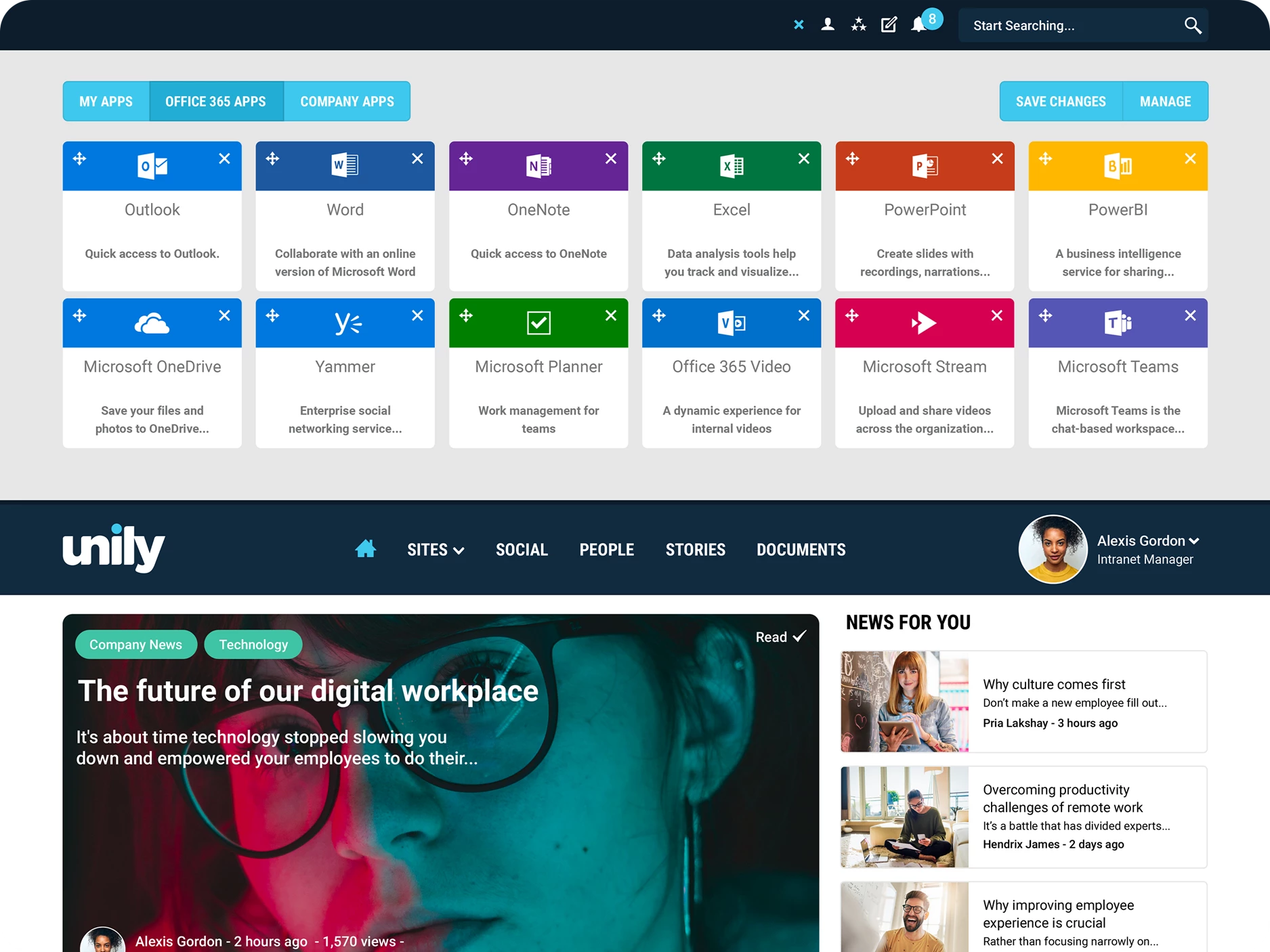
The 10 pillars of enterprise intranet design
Below are ten usability heuristics adapted to specifically cater to your enterprise’s intranet design, alongside key tips and examples you can use to elevate the employee experience:
#1. Visibility and findability
"Findability precedes usability; in the alphabet and on the Web. You can't use what you can't find."
Your employees should always know where they are and where they’re going when using your platform. Clear signposting, easy access to your site’s navigation menu, and optimized, logical pathways all help users efficiently navigate your intranet.
A perfect example of this can be seen in the “You are here” markers you find on maps, which immediately communicate where people are in relation to their surroundings, and which way they should go next.
Translating this to your intranet, focus efforts on providing a clear and concise navigation bar, and make sites and resources easily findable; don’t bury them underneath a thousand sub-sections.

#2. Draw inspiration from the real world
"System should speak the users’ language with words, phrases and concepts familiar to the user, rather than system-oriented terms. Follow real-world conventions, making information appear in a natural and logical order."
UX writing is a crucial but historically overlooked factor of intranet design. Though things are starting to change and businesses are considering the language they use on their platform more, there is still something of a disconnect between our work platforms and the technology we use in our everyday lives. Make sure that the language you’re using across your employee experience platform is commonsense, because employees shouldn’t have to learn new terminology to use your intranet.
A real-world example of, well, mimicking the real world, could be a remote control that maps its buttons to mirror the appearance of its device or the universal icons we use to depict certain functions, like the power button, so users immediately understand how to use it. For your intranet, this means calling a spade a spade: Don’t stray too far from the language and features that we expect as standard.

#3. Give users freedom
"Users often choose system functions by mistake and will need a clearly marked 'emergency exit' to leave the unwanted state without having to go through an extended dialogue. Support undo and redo."
Mistakes happen, so building ways of undoing and editing actions into your design is a mandatory requirement. When users can’t easily navigate and control their interactions with your platform they rely more heavily on training and support, as they lack the freedom of control to be efficient.
In the real world, we see this every day in the form of clearly marked entrances and exits. Or for another example, try to imagine for a moment how difficult it would be navigating the internet if our browsers didn’t have back, forward, and refresh functions.

#4. Consistency is key
"Ensure visual design is consistent and conforms to user expectations."
Jakob's Law states that people spend the majority of their time using countless other digital products, not yours. People’s user experiences with those other products set a standard of expectations that trickle down and apply to the digital employee experiences you deliver, too. A lack of consistency across your platform increases the cognitive load placed on users, as they must decode and translate your design into the common language they’ve come to expect from digital experiences.
Design for the patterns and workflows your users are accustomed to. Site navigation, branding and theming, and the overall look and feel of your employee experience platform all need to align to deliver a single, consistent user experience. As well as your general aesthetics – fonts, styles, and colors – this also applies to your integrations and third-party tools, as a single pane of glass view of the entire digital workplace builds synergy and boosts efficiency.
#5. Prepare for failure
"Even better than good error messages is a careful design which prevents a problem from occurring in the first place. Either eliminate error-prone conditions or check for them and present users with a confirmation option before they commit to the action."
Remember that old saying, ‘failure to prepare is preparing to fail’? Well, it’s not just a catchy idiom, it also applies to your intranet design. How-to guides, step-by-step instructions, asking users for confirmation before acting on requests, and speaking in plain, easily understandable language are all steps you can take to ensure users aren’t lost on your platform and reduce errors.

#6. Cognition, not recognition
"Ease of use may be invisible, but its absence sure isn’t."
Always provide instructions and context to the user’s actions. Playing into the previous two points, when we often talk about intuitive design and the familiarity of your platform what we refer to is the ability to pick up and use it from the jump. If you're successfully signposting your intranet navigation, where things are stored, and use clean and direct design, you're playing into what they're used to and taking away a lot of the user's cognitive load.

#7. Agile and flexible
"Accelerators — unseen by the novice user — may often speed up the interaction for the expert user such that the system can cater to both inexperienced and experienced users. Allow users to tailor frequent actions."

They say never to cut corners if you want a job done right, so intranet user experience design may be the only time you're encouraged to take shortcuts. The kind of shortcuts we're talking about are typically called accelerators, and they help users to tailor the user experience to their needs. Whether its a configurable apps and tools menu or a favorite links section to help people find things quicker, accelerators keep your platform agile and flexible to the wants and needs of your users.
#8. Less is more
"Genius is the ability to reduce the complicated to the simple."
Minimalist web design has certainly become a dominating trend in today's world. A cursory glance at any web development agency's website can confirm as much. While your intranet software shouldn't be blank slate, you need to be wary of bombarding users with too much information on one page. Identify areas where you can cut down on clutter and keep text concise.

#9. Smooth over bumps in the road
"A problem well stated is a problem half solved."
You must give feedback when users attempt to complete a process on your intranet but make mistakes that result in errors. The first step to solve a problem is to clarify it, only then can you propose a solution. By clearly showing users the error in their actions and directing them to solutions, you're not only making your platform easier to use, you're also actively encouraging users to learn more about the intranet and the things they can achieve with it.

#10. Keep help at hand

"Even though it is better if the system can be used without documentation, it may be necessary to provide help and documentation. Any such information should be easy to search, focused on the user’s task, list concrete steps to be carried out, and not be too large."
Employee experience platforms strive to deliver intuitive user experiences that empower people, but even the most advanced technology is still prone to the occasional bad day. When all else fails, users should know where they can easily access help or guidance on your platform.
Training, documentation, and contacts that employees can turn to when they're stuck should not only be available, but easy to find and even easier to access, either with their own dedicated help site or via frequently asked questions forums.
Want to elevate the employee experience?
If you're interested in learning more about intranet design and the keys to driving engagement with your employee experience platform, get started with a demo of Unily.
Get started. Get your free demo.
Reinvent your intranet for the employee experience era.